Seeing a lot of traffic to your store is a great feeling, however it’s even better when that traffic leads to more purchases. When you start to see a high influx of visitors to a product page, but very few of those making a purchase, you might start to wonder why that may be the case. What’s stopping them from checking out?
That’s where Conversion Rate Optimization comes in.
What is Conversion Rate Optimization (CRO)?
Before we talk about optimization, let’s start first with what a conversion rate is. A conversion rate is the percentage of users who complete a desired action on your website, with the action being referred to as conversion. Conversions can be anything from email sign-ups to downloads, however in ecommerce, it will most likely refer to purchases. The conversion rate will then be the percentage of visitors who become customers, i.e. make a purchase within a given time period.
Conversion Rate Optimization is the process of increasing that percentage. We start by analyzing the conversion rate of our key landing pages, discovering friction points, and taking action to make improvements. This is through a combination of best practices, UX/UI auditing, and customer experience.
The importance of customer experience, UX, and UI in CRO
Conversion Rate Optimization can get very data heavy. While this isn’t necessarily a bad thing, it’s important that we don’t lose sight of who is at the heart of your store - your customers. Real people and their behaviors and preferences can’t always be put down to numbers. That’s why it’s important to take an approach to CRO that encompasses data, CX, UX, and UI - it should be customer-led, and data-driven.
Use your data to highlight weaknesses, use CX/UX/UI to make improvements, and then again use data to measure success. By making customer-led changes to your store, thinking about their behaviors, and how to improve the overall experience, you’ll ultimately see improvements to your conversion rate because the experience is better. Your data shouldn’t end at the conversion rate itself or even page interactions, but also other customer satisfaction metrics such as ratings, reviews, qualitative surveying, and customer support interactions.
Understanding industry benchmarks, and how your store compares
Setting benchmarks is an important part of measuring success and understanding where your store needs to improve. However it’s also important not to be overly concerned with industry benchmarking, and comparing your store against those industry averages. If for example you were to look at fashion in general, that’s going to include a whole range of different types of business from luxury to everyday wear, and from huge companies all the way down to independent retailers. This is going to cause a great deal of variance in conversion rate averages, and if those rates are actually good or not. Luxury fashion brands will likely see a lower conversion rate than everyday apparel brands, due to the price point making it a more considered, less common purchase for the average consumer however the value of each order will be considerably higher. Moreover, conversion rates fluctuate throughout the year and across regions around the world.
That’s why it’s so important to use your store, customers, and data to set goals and benchmarks. You can certainly take averages in your industry into account, however you shouldn’t use these as the be-all-and-end-all for your CRO efforts. You want to create an experience that is specific and speaks to your customers and target audience; this approach will ultimately lead to a better CRO strategy.
7 steps to improving your conversion rate
#1 - Discover which pages need to be improved
The first step in improving conversion rates is to actually identify which pages could be improved. This involves using tools such as Google Analytics to determine the conversion rates for individual pages, however it should also be used to analyze the customer journey to the target conversion. In many cases, a customer will land on different pages throughout your site before they make a purchase, therefore you want to analyze the actions taken and where your site experience is falling short throughout that journey.
To do this, look at the paths customers typically take that land on checkout, and ask some key questions:
- Where are customers coming from? i.e. traffic sources - social media, email, search.
- What does the typical path look like for each of these sources?
- Which points in the journey see the biggest drop-offs in traffic?
- Which pages have the lowest conversion rates throughout the customer journey?
The answers to these along with the associated analytic data will give you a good idea of which pages require conversion rate optimization.
Once you know which pages need attention, use other tools such as heatmaps to understand where you’re falling short. Heatmaps allow you to see where users are engaging with page content, how far they scroll etc. Some tools even allow you to segment based on traffic source, so this can add an extra layer of useful data to your conversion rate analysis.
#2 - Understand what your audience wants
Once you’ve identified pages to improve, you want to look at your target audience. It’s important to understand what they actually want from your site experience, more than just what data tells you. You can use other metrics to better understand your audiences wants and needs, such as:
-
Customer support data - Do you see a high percentage of support tickets related to the same issues? These might include site usability, page performance, product information, etc.
-
Surveying - Engage your most valuable customers and ask them specific questions about your site experience, particularly around pages you want to optimize.
-
Feedback and reviews - When a customer goes out of their way to tell you what they did and didn’t like, listen to them. Reviews might, for example, mention that the quality of the product was great, but they found it a bit difficult to use your mobile site.
- Returns information - Reasons for returns can be an extremely helpful indicator of where your experience is lacking. If you’re looking to improve the conversion rate for a particular product, and you see a high percentage of returns related to product sizing then this may mean you need better sizing information on the page.
Look also to your competitors’ sites - what more is their site experience offering that yours isn’t? Or perhaps you may notice they’re missing something. You should also take a look at larger sites in your industry niche, as they’ll likely be leaders in experience due to having additional resources to put towards CRO. This can act as a sort of “experience benchmark” in that this is what customers expect from a much larger brand, and they’ll likely expect just as high quality an experience from your store. For example, if you have a physical retail outlet and you don’t currently list in-store availability, but you notice larger competitors do, then this may be something you want to look into to add to your customer experience.
#3 - Optimize the technical experience
Page performance can be a conversion killer, that’s why it should be the first thing you optimize. 79% of consumers dissatisfied with a website’s performance are unlikely to purchase again, and just 1 second of delay to load time can have a 7% loss of conversions and 16% decrease in customer satisfaction.
Here are some key performance areas to analyze and improve:
Site speed
Speed will be one of the primary performance factors affecting your conversion rates. Customers don’t like to wait for pages, and their expectations are very high - 70% of consumers say that page speed affects their willingness to make a purchase. Use tools such as PageSpeed Insights to determine where your pages are missing the mark on speed. Use the suggestions given as well as implementing some page speed best practices such as minifying code, optimizing images, and removing any unnecessary third party apps.
Navigation
It should be extremely easy for your customers to move through your site, navigating back and forth between pages as they need to. If at any point this proves difficult, there’s a strong chance they won’t bother to stick around. For example if they’re browsing a product page and want to check out something else, make it easy for them to go back using breadcrumbs and “previously viewed” sections. If they’re on the checkout page, give them easy access to shipping and delivery information as well as your FAQ. The easier it is to navigate, the better the experience.
Mobile experience
Mobile is fast becoming customers’ preferred way to shop online due to the convenience of being able to quickly browse and purchase on their smartphones wherever they are. 59% of consumers say that being able to shop on mobile is an important factor in deciding which brand to shop with. Typically we build sites on desktop, so it can be easy for mobile to slip through the cracks when building new pages or adding new features. It’s important then to analyze the mobile experience of your store, and ensure it’s fully optimized for shopping on the go. Simplify your menus for mobile browsing, as well as keeping forms short, and checking that all buttons/CTAs are large enough.
User interface (UI)
This will encompass some elements of the other aspects above, but specifically we’re looking at things like:
-
Tapability - This is how easy it is to interact with clickable elements on a page, primary buttons. These should be obvious, large enough, and obviously labelled. For example if the button adds an item to the cart, it should use plain and obvious language such as “Add to cart”.
-
Spacing - Especially on mobile, spacing can present a real problem when interacting with elements on a page. It also helps with readability and accessibility. Every element should be well spaced, with no cluttering.
-
CTA placement - Don’t make your users hunt for the CTA, as if it isn’t obvious they won’t waste their time. Put your primary CTAs in obvious locations that are easy to navigate to. Even better if these can “float” as the user navigates the rest of the page.
- Color and contrast - Use of color and contrast will draw attention to key elements of your page, and overall will help with readability. Too many bold bright colors can be distracting, but equally if all colors are muted tones this may mean the user’s eye isn’t drawn to your CTA.
- Font style and sizing - No likes struggling to read a product description, therefore it’s important to make sure the font you choose is easy to read and the sizing makes it comfortable to do so.
How users are able to interact with your page is just as important as how good it looks, so by going over these more technical aspects you can potentially identify elements that were affecting your conversion rates without even realizing it.
#4 - Improve your page content
We mentioned earlier that a big part of conversion rate optimization is figuring out what influences your customers to make a purchase. While technical performance is important, your site’s content is perhaps more important. It’s what shows the customer the product they’re considering - images, descriptions, extra information.
Images
All your site’s images should be high-quality, descriptive, and useful. Images are a vital part of the customer experience, as they give the customer an idea of what to expect from your products before they make a purchase. If your images are low quality and there aren’t many, it can be off putting.
Image choice is also important - different pages will require different images. Homepage images should convey your brand, products, and overall personality. These can be more lifestyle focussed, busier, and exciting. However you don’t want to clutter your homepage with too many - stick to a few that really capture your brand and what you’re all about.
With product pages, these should be clear, uncluttered, and focus on the product. Opposite to the homepage, you want a few images for each product showing different angles, any included accessories, and a couple of use examples. With apparel, for example, you may want to show the product on different body types, or with a kitchen gadget an image of someone actually using the product. Whatever will be most useful to your customer in allowing them to best imagine the product once it’s in their hands.
Product Descriptions
Product descriptions can be make-or-break for conversions, and how detailed they should be will largely depend on your individual brand. For example if you sell a product that’s widely understood such as t-shirts, socks etc then you won’t need as extensive a description as a health supplement or a skincare product which customers may be less familiar with. In general for your summary description at the top of the product page, it should be concise, easy to scan, and objective. Add a bit of brand flair, but try to stick to the essential details a customer will want to know. These details might include:
- Materials
- Color
- Product dimensions
- Sizing
- Included accessories
- Technical specifications
- Personalization options
If you want to go into further detail, include an expanded description further down the page with even more information. Stick to what customers will want to know before making a purchase.
With both images and copy, you can use returns, feedback, and support data to help pinpoint where these need to be improved. If you see a high proportion of returns due to “item not as described” then you’ll want to look at why your product description isn’t meeting the mark.
#5 - Build more trust with the customer
Trust is a huge factor in customer purchasing decisions, and can be what tips the scale in favor of a conversion. The more trust signals you can send a customer throughout their experience, the more likely they’ll be to make a purchase. It’s best to take an approach to these signals that encompasses their entire journey rather than just on the pages you’re looking to optimize.
Reviews
The vast majority of customers read reviews - 9 in 10 say they always do so before making a purchase. It’s easy enough for your brand to say your products are great, but it’s another for fellow customers to rave about them. Display reviews throughout the customer journey, on different pages throughout your site.
- Testimonials or featured reviews on your homepage.
- Star ratings and reviews on product pages.
- Star ratings on catalog pages.
- Links to third party trusted review sites such as Trustpilot or Google.
These will give customers added confidence that they can trust the quality of your products and customer experience.
Customer support
When a customer has a question or an issue, they want to know your customer support is going to be fast, efficient, and give them the answers they need. 96% of global consumers say that customer support is important in deciding on brand loyalty, and 78% say they’ve backed out of a purchase due to a poor support experience. To improve your customer support you should:
- Offer self-service options such as a searchable FAQ.
- Keep your FAQ up-to-date, adding seasonal sections during key sales periods.
- Have an on-site AI chatbot to field questions instantly.
- Use a robust customer support platform so different team members can see all the information for each customer to provide tailored support fast.
- Include shipping and returns information on product pages.
- Follow up with customers who get in touch with your support team to ask about their experience.
If they know they can get all the answers they need quickly, they’ll have more trust in your store and be more likely to make a purchase.
Security
As amazing as the internet can be, it can also be prone to scammers and privacy issues. Make it clear to customers that your site can be trusted when it comes to security, and it will allow them to make purchases without worrying about their private information.
All stores powered by Shopify are PCI compliant by default, covering all six PCI standard categories such as secure networks, regular testing, and protecting cardholder data. They have a dedicated vulnerability management program, giving merchants and customers peace of mind. Ensure that this security is mentioned on key pages such as your checkout - you could also display Shopify’s security badge on your site as an extra visual indicator.
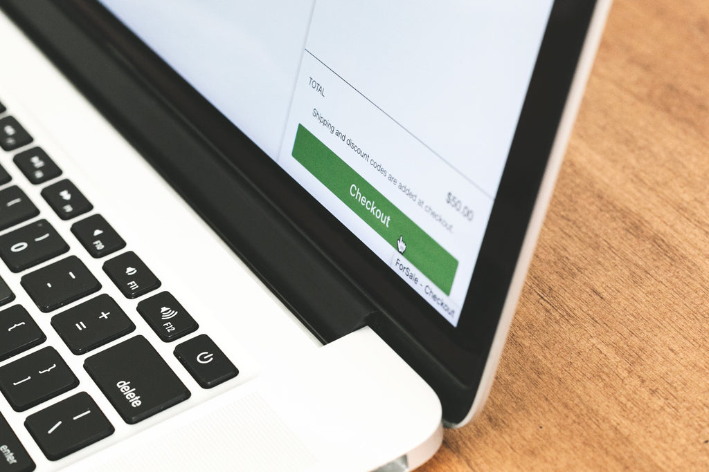
#6 - Optimize the checkout experience
While “Add to Cart” might be the target conversion for a product page, the true goal is to get that customer through checkout and complete their purchase. This can often be the final hurdle for merchants, as it seems like something straightforward but there is a lot that can be done to truly improve the checkout experience and encourage conversions. Improving the user experience for your checkout flow can help to boost conversions and reduce abandoned carts.
-
Make use of pre-filled forms
Filling out details every time can be a pain for customers, and is one of the areas of checkout that takes the most amount of time. Enable customers to pre-fill their details, either using optional accounts on Shopify or installing the Shop Pay app that will remember their details as they move between sites.
-
Keep it short and simple, especially on mobile
Everything on mobile should be fast and easy, and that includes your checkout process. If a customer is checking out on mobile, reduce the number of fields they need to enter or steps they need to complete so you can get them through checkout as fast as possible.
-
Allow guest checkouts
24% of consumers say the primary reason they’ve abandoned a cart is due to being forced to create a customer account. You can seriously boost your chances of making a sale if you allow customers to choose the option that best suits them. Detail why making an account is valuable such as quicker checkout, loyalty points etc. if you really want to encourage account creation.
-
Offer quick checkout options
Sometimes, your customers will want to snap up a product as quick as possible. It might be time constraints, simply not wanting to go through the full checkout process, or it may be due to wanting to snag a limited offer such over Black Friday. In any case, you should offer quick checkout options such as PayPal or Shop Pay that will allow them to breeze past the usual process.
-
Expand your payment method options
This is especially important if you’re looking to expand internationally, as different regions have different preferred payment methods as well as currencies. Opening up your options to include a variety of payment gateways such as QR codes, PayPal and more could be a game changer for customers.
Making your checkout process super fast and easy is one less obstacle between your customers and a successful conversion.
#7 - Do more to engage abandoned carts
There are many reasons why a customer may abandon a cart, but their journey doesn’t end as soon as they leave your site without a purchase. Abandoned Cart email flows are pretty commonplace in ecommerce, however rather than leaving it at a simple two or three step automation, there is more that you can do to engage those customers and bring them back. The key lies in how you use your communication channels, and how you make use of personalization.
Abandoned cart emails are extremely effective - according to Klaviyo, their customers see an average open rate of 41.18% on Abandoned Cart emails, and the conversion rate is 3x higher than any other automated flow. That’s a huge opportunity for merchants to boost conversions. With how many marketing emails a customer will receive in a day, you need to be smart and find unique ways to stand out. One such way is through personalization - 59% of consumers who have experienced personalization have said they believe it influences their purchasing decisions. Use your store’s data on that customer to engage them with content that is tailored to their preferences and interests. That might be the other products they looked at that they didn’t add to their cart, or showing them complementary products to what they did add. A standard abandoned cart email is unlikely to catch their eye, but one which addresses them by name and attempts to give them more value than just showing them what they left behind might do the trick.
You can take this personalization a step further by using segmentation to send different messaging depending on the customer’s history with your store. This might include:
- International vs domestic
- New vs returning customer
- Cart value
- VIP customer
- Loyalty program status
This will then influence whether or not they receive a cart incentive, and what that might be. For example if you want to encourage an existing customer who engages with your loyalty program, you might offer them bonus points. Or if it’s a new customer, you may want to offer them 10% off their first order to sweeten the deal. To best understand which incentives and messaging works for each audience segment, you may want to conduct A/B testing. This will ensure your abandoned cart emails are optimized and you’re sending incentives that actually convince customers to return to your store.
---
With any change you make to your store, it’s important to monitor, test, and analyze to ensure you’re making the right decisions and that those changes are having a positive impact on conversion rates. Doing this on an ongoing basis will help you to identify areas for improvement, and move quickly on making changes based on successful strategies you’ve employed in the past. This will all contribute not only to improved conversion rates but to a better customer experience that engages and satisfies your target audience.