
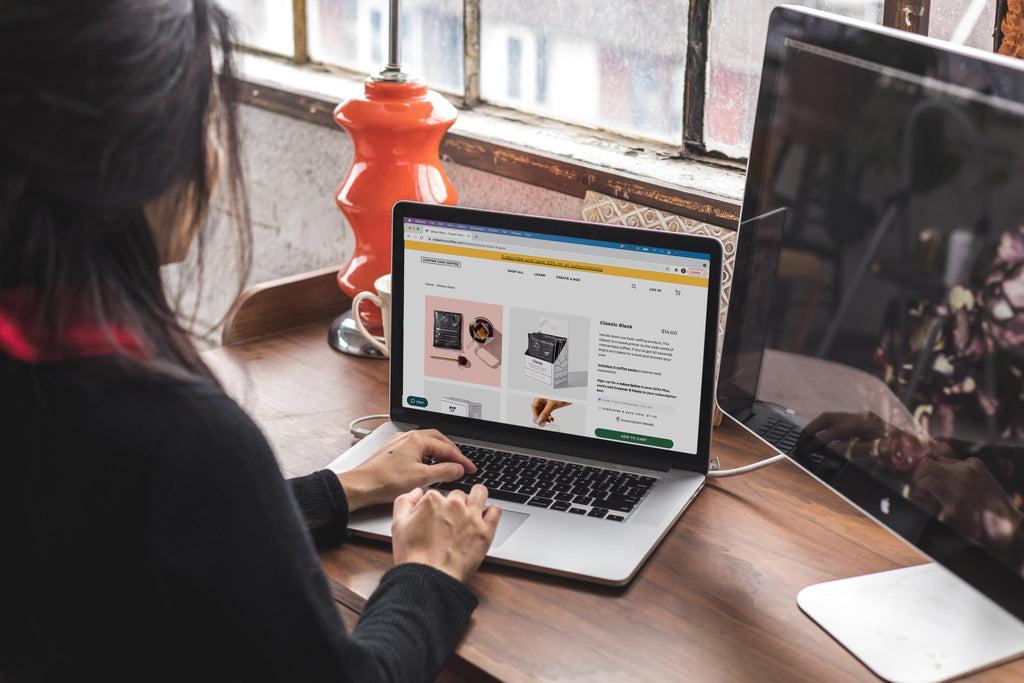
Of all the pages on your Shopify store, your product pages are one of the most important and valuable. They showcase your products, inform your customers, and can be make-or-break when it comes to purchasing decisions. They have the power to turn casual browsers into loyal customers, but in order to do that you need to have a truly great product page.
Why you should go beyond the basics on your product page
Having a great homepage convinces the customer to explore more of your store. Having a detailed FAQ can help with the purchasing process. However it’s product pages where a customer is going to actually be convinced to make a purchase. It’s where you’re going to display the product you want them to buy, give them all the information they want to know, and instil the confidence they need to click “add to cart”.
Your product page then must achieve a few things - demonstrate the product, build trust, and convince the customer to convert. A good product page should guide them through the purchasing process, doing so by:
- Giving a detailed overview of the product along with key details such as dimensions, specifications, ingredients etc.
- Showing customers what the product actually looks like using a variety of visual elements.
- Demonstrating trustworthiness through reviews, testimonials etc.
- Letting the customer know how the purchasing process works.
- Making it easy for the customer to proceed through the rest of the purchasing process.
- Giving them ready access to further information and support.
In order to achieve all of this, you need to go beyond the basics of a good product page and turn it into a great experience driven resource.
Creating a great product page requires you to think in terms of Customer Experience/CX, User Experience/UX, and User Interface/UI.
Customer Experience (CX) - How the page adds to the customer’s overall ecommerce experience with your store. This will be how they perceive their interactions with your site and brand, and encompases everything from discovery to post-purchase and retention.
User Experience (UX) - This is the way a user perceives and experiences interacting with your site. That might be ease-of-use, navigation, or page layout.
User Interface (UI) - UI is how that experience is delivered in how it looks and functions, for example color palettes, font sizes, and button responsiveness.
Therefore when putting together your product page, it shouldn’t simply be a question of which features are standard practice but which will be the most useful to customers or users in how they engage with your page. By taking an approach led by customer experience and UX/UI, you can design a product page that perfectly pitches your products and brand to potential customers and delivers a valuable, engaging experience. This ultimately will lead you to a page that deeply understands what your customers actually want and need, and thus improve conversions.
7 Basic Product Page Features
Every good product page starts with some basic features, and getting these right off the bat will give you a solid foundation on which to build in other features.
The seven basic features every good product page needs are:
- Page layout
- Call-to-action, pricing, and title
- Product Description
- Images
- Page navigation
- Shipping information
- Customer support
These cover your bases in terms of the essentials that your customers will need in order to understand your product and your store experience, and use the page easily.
Have an intuitive, customer-led page layout
Creating a great product page starts with a great page layout. After all, a cluttered, slow page with patchy responsiveness and confusing hierarchy is going to make for a poor customer experience if the customer stays on the page at all. A product page layout which is clean, intuitive, and responsive will serve to guide the customer through your page as though it were a proper sales pitch and make it easy for them to navigate and find the information they want.
When it comes to a general layout, there’s not much sense in trying to reinvent the wheel. Customers are used to product pages and their layouts, and trying to change the basic format will only lead to potential confusion for the customer. These general rules include:
- Primary product imagery on the left (on desktop).
- Title, Call-to-Action, Price, and overview above-the-fold i.e. at the top of the page.
Most Shopify store templates will follow these guidelines, so a lot of the work there is taken care of. Some page layouts may deviate slightly, however for the most part all of the most vital overview information, CTA, and product imagery will be displayed first at the top of the page with additional information and features further down the page.

From there, it’s about customizing to suit your brand and also adding in any extras to your page layout that will help your customers. When we say to make your layout intuitive, it’s about thinking what your customers will instinctively want to see as they scroll through your page. Think about both UX and UI - what content and information do you want to highlight? How will the user interact with this content? How will you present it?
A typical product page layout might then be presented like so:
- Overview - Title, primary product image gallery, short description, CTA, pricing, customization/size options etc.
- Additional information - Specifications, product features in detail, extra imagery or videos.
- Reviews and product recommendations
This is intuitive as it follows the natural progression of the customer thought process. The overview gives them the necessary details, if they’re interested then they scroll down for more information about the product, and then if they need convincing they scroll to read the more detailed reviews. They also may consider other products that are suggested as recommendations, if they’re either not sold on the product page they’re currently viewing or want to find other complementary products.
While most product pages will follow a similar layout, the features you include will largely depend on your customers and what they’ll find useful and convincing. Consider this alongside some customer surveying to find out which features and layout your audiences would find the most appealing.

The above example shows Princess Polly’s “Styled By You” feature on product pages. As they’re a clothing brand who frequently feature influencers and are popular on social media, it’s valuable to their customers to see what their clothing looks like on real customers as well as reading reviews.
Have a clear product overview with call-to-action, pricing, and title
Before a customer reads your product description, they’re going to scan the page and immediately see a few key elements first - the product name or page title, pricing, and call-to-action. There may also be a few extra elements such as an aggregate star rating, customization options, quantity selector, and subheading. These elements allow the customer to very quickly ascertain what the product is, how much it costs, and determine their initial interest.

The above example shows Ledger’s Nano X, and the overview gives the customer everything they need even without reading the description. It gives the product name, price, and CTA, as well as information about when the product is expected to ship, a star rating, and a bonus “free shipping” notice. Keep your product overview clean, clear, and easy to read using contrasting colors to highlight key elements such as your CTA, and font size and style to emphasize the product name and price. The customer can then see all the need-to-know information without having to scroll through the page, and can choose to do so if they’re interested in learning more.
Write a great description
Writing the perfect product description is harder than it sounds. According to the Baymard Institute, a poorly written description or one which doesn’t fit customer needs will more than likely cause customers to abandon the page completely. Therefore you want to write one which suits your customers’ needs, and sells them on the product in question.
To do that, your description should be concise, scannable, and objective.
Concise - Your description should have just the right amount of information and nothing too detailed. Too long and it’s unlikely a brand new site visitor will actually bother to read it.
Scannable - It should be really easy for a customer to scan over the description and immediately glean the information they need. You can use bullet points to make this easier.
Objective - While it’s always good to add a bit of brand flair to your site copy, try to keep your description as objective as possible. This makes it easier to read, and the information seemingly more reliable to your customers.
It’s tempting to go into a lot of detail when describing your products, as you want to try to convince a new customer to make a purchase. However it’s much more effective to keep your initial description short and to the point, using other product page features to go into further detail as you capture the interest of your target customer.

Shown above, Homesick’s description of their “Let’s Toast” candle strikes a balance between branded and objective language. They give a brief description of the occasion the candle is best suited to along with what it actually smells like. This is followed by a bulleted list of essential features that their customers would want to know such as its burn time and what it’s made from.
Make use of imagery
Your product description could be the best there is, however without something visual it’s unlikely many of your customers would make a purchase. Images are descriptive in their own way and should complement the product description.
Here are some general rules for your product imagery:
1. Only ever use high-quality images, ensuring the product is the focus of the image.

2. If you do want to include a product shot with set design, ensure the product is still the focus without clutter.

3. Include a variety of images of the product from different angles.

4. Add contextual images to your gallery to show the product in different use settings.

5. Include images of any included accessories, and if possible have some to-scale imagery.
For customers with accessibility needs, ensure you include descriptive image alt tags. These will ensure that every customer can understand your product imagery, and it has a bonus of being great for your page’s SEO.
Keep your page navigation simple
It isn’t just your product pages that a customer will use while on your site. Their path to purchase may not be as linear as homepage to product to checkout; it may include going back to your catalog page, checking a different category, looking at FAQs, contacting customer support, and more. Therefore it’s important your on-page navigation is clear, simple, and easy-to-use.
We’re going to look at:
- Primary navigation
- Categories and subcategories
- Breadcrumbs
- Internal linking
- Mobile

Your primary navigation menu should stick to your core pages that customers will want to navigate through. Keep the number of menu items to a minimum, using terms which make it obvious what that item is for, i.e. “Shop”, “Visit Us”, “Blog”. You can then expand on these in subcategory menu items; create those which will be most useful for your customer navigating your catalog.

In the above example, La Colombe’s primary menu item “Shop” breaks down into different categories and subcategories that help their customers navigate through their large catalog. It’s intuitive, as it anticipates the kind of categories that their customers will need and expect.
You should also implement a breadcrumb menu on product pages. This is where the previous pages are displayed as links on the page showing the path the user has taken to get there, in other words breadcrumbs leading them back to where they started.

This helps the user to navigate back to where they’d previously visited, in case they want to go back easily to a given page. Another essential navigational tool is your sitemap, located at the bottom of every page.

This sitemap allows you to give customers quick access to links that are typically found in your primary navigation. This may be so they can quickly find your customer support, or information about your brand. It’s also helpful to include your most popular categories which your customers may want to check out. These sitemaps are also valuable for your store’s SEO.
Now, let’s consider internal linking and which navigational links will be most useful to feature for your customers. Some common links you may want to include are:
- FAQ page
- Contact Us
- Product specific FAQs
- Care instructions
- Sizing guide
- Shipping information
These are going to help your customers in their journey to purchase, as it’s all information they’re going to need before they click “checkout”.

Finally, it’s important to think about how your navigation translates to mobile. Mobile accounts for 57% of global internet traffic, and 59% of consumers say that being able to shop on mobile is a major deciding factor in who they choose to shop with. Your mobile navigation needs to be just as intuitive as your desktop site, and be designed with usability in mind.

Prioritize tapability and simplicity for your mobile navigation, considering how people will use it on a smaller device.
While most of the above is more general to your store and less specifically about product pages, it’s still vital to a great product page that your site navigation is intuitive, easy, and clear to maximize the customer’s experience.
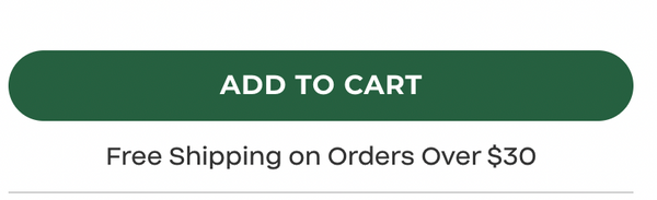
Display shipping information
Shipping is one of the most important factors in a customer’s decision making process. Moreover, free shipping has the power to drive up cart AOV with 53% of consumers saying they add more items to cart to qualify for free shipping. Whether you offer free shipping or not, it’s important to give customers information about which shipping options are available to them as they browse your product page.
If you offer free shipping, highlight this in an obvious spot on your product page preferably within the product overview so that customers can immediately see what they need to do to qualify.
If you don’t offer free shipping, then it’s worthwhile to add what options you do offer somewhere on your product page. This may be in a tab along with your extended product description, in an accordion menu, or as a link to a FAQ page.

Ideally, you want to give your customer all the information they’ll need to make a decision therefore having shipping details on the product page helps to eliminate friction in that decision.
Make it easy to contact customer support
Customer service is a key part of customer satisfaction - 96% of customers globally say that customer service is an important factor in which brands they remain loyal to. In one study, 83% said that they want some kind of customer support during their purchasing journey and 51% said they’d abandon a purchase if they didn’t have easy access to support.
This customer support should be communicated on your product pages in a couple of key ways:
- On-page FAQ or obvious links to FAQ
- Chatbot or other on-page support channel
- Contact us links
Having an on-page FAQ makes it easy for customers to find answers themselves quickly, without having to wait on a customer service representative. Especially if their question is straightforward and product related, they likely won’t want to wait for a response.
You can also include user submitted questions on your product page. This will allow you to answer real questions your customers have, and display these in case future customers have similar queries.

Implementing a chatbot is also a valuable addition to your store, as these can be set up to field common queries about orders, shipping, and ongoing promotions without a manual response. These can then also allow customers to get in touch with your team if the chatbot cannot satisfy their query.

It’s equally important to ensure that as well as these self-service and semi-automated options that you make it easy for customers to get in touch with your team as 30% of customers say not being able to get in touch with a real human is the most frustrating part of customer service.
Essential CX Features
When your basics are covered, it’s time to implement additional features that are essential to the customer experience. These are those which are going to build confidence, help to convince, and deliver greater personalization.
- Reviews
- Detailed descriptions
- Product recommendations
Along with your basics, these extra features will go a step further in creating a customer-led experience.
Showcase reviews
Reviews are a major part of the decision making process for customers. 93% of consumers say online reviews influence their decisions, and 76% are more likely to trust reviews from their peers than content shared by a brand. They’re a powerful tool in building trust and confidence before the customer decides to part with their cash, and therefore they’re an essential part of your product page.
Having a star rating displayed at the top of your product page is just the start, to really maximize the value you see from your reviews you should display them further down the page in more detail.

This will allow potential customers to read what their peers think about your products, service, and overall experience. Your product images might look great, and your description may read well, but ultimately the customer will trust the opinions of other customers more and therefore it's vital to have these prominently featured on your page. It shows that not only have you got great reviews, you're proud to display them and have confidence in your products. This instils even greater confidence in potential customers.
Give more detail with extended descriptions
Sometimes you won’t be able to include everything your customers need to know in an overview description. Therefore if you want to keep your overview succinct and optimized, you should look to add more detailed descriptions and extra information elsewhere on your product page so that customers can easily find it if they need more.

In this example from Vana Chupp Studio, they want their customers to know more about the dimensions of the product, information about customization, and timeframe for delivery. These are details which customers will both want and need to know ahead of ordering. By including these further down the page separate to the overview, it keeps the page neat, organized, and more intuitive. The overview sells the customer on the product, these extra details give them more information they’ll need before they decide to commit to a purchase.
To know what you should include as extra information on your product page, ask yourself what your customers will need to know about your specific products. That might include:
- Unique product features
- Product dimensions
- Additional product specifications
- Nutritional information and ingredients
- Product care information
- Customization options and instructions
- Turnaround time frame on customized products
- Included accessories
- Product warranty information

The above example demonstrates how Allbirds use additional descriptive information further down their product page to go into more detail about specific features of their products. Doing this gives them more space to showcase these key product features without crowding the top of the page.
Feature product recommendations
As part of helping the customer journey along, including recommendations on product pages is essential. If a customer is undecided about a product, these recommendations can help them find a product that better suits their needs or perhaps show them other products that complement the one they’re currently viewing. In either case, they’re an essential feature of any product page.

There are a few ways you may want to incorporate these into your product pages:
-
“You may also like” - These can be products that customers typically view as well as the product for the page in question, and/or related products. It can also be based on individual browsing history if you want to personalize recommendations.
-
“People also bought” - Using store data, display products which are typically bought either alongside or instead of the product.
- “Complete the set/look” - Products which match or typically are sold as a set.

These suggestions add the customer experience, making it more engaging and increasing the chances of satisfying their needs and making a sale.
Added Value Features
Now that your product page has every essential feature it needs, it’s time to really ramp things up and look at added-value features. These are those which while not as necessary as something like a call-to-action, are still important if you want to deliver a really great store experience.
- Videos and Graphics
- Out-of-stock options
- Local fulfillment options
Give more visual value with videos and graphics
Having a gallery of product images is an essential part of a product page, however you can take that a step further by adding other visual elements that add more value to the customer journey. Videos, graphics, and other visual elements can help to demonstrate your products further and give customers more confidence than a normal product image would be able to.

These added elements also allow you to convey information that would normally be included in a description in a much more engaging way than a wall of text. These set expectations for customers, meaning they have a much clearer picture of what they’re ordering and more confidence in the product they’ve purchased.
A few ideas of what other visual elements you could include are:
- Video demonstrations of product use
- Graphics depicting key product features and uses
- If you sell food and drink, a video of recipes or use cases for the products
- Images of ingredients or components in the product

Offer out-of-stock options
Occasionally running out of stock is an inevitable part of running an ecommerce store. Especially if you’re running a sale, or if your store is facing supply chain issues, these are factors that can affect your inventory levels and have a knock-on effect on your customer experience. It’s important then to have some options at the ready for when an item does go out of stock.
Having a back-in-stock notification enabled achieves a couple of goals; the first is that it improves the customer experience by giving them the opportunity to come back to purchase the item they wanted at a later date. The second is it then opens up a new channel to engage your customers and provide them with an even better experience using your email and SMS communication.

Another option that is especially helpful around the holidays is enabling a gift card option for when a product is out of stock. Govalo is a gift card app for Shopify which allows you to display the option for customers to purchase a gift card instead of the product that is out of stock.

If the customer was ready to purchase, then this gives them an attractive alternative if they’re purchasing a gift as it means the intended recipient can still make a purchase on your store. Gift cards are becoming a much more desirable option for gift buyers and recipients, so facilitating this will ensure you don’t lose potential customers and sales as well as delivering a great experience.
Detail local fulfillment options
If you have a physical store, then offering local pick-up and fulfillment options is a great way to target a local audience. Especially during key periods such as BFCM and the holidays, customers are more likely to make use of these options in order to secure the items they want as fast as possible. However in order to guarantee customers use these options, they need to be made aware of them first. That’s why it’s important to display any local fulfillment options on product pages, so that customers know they can buy online and collect in store.

Some ways you can include local fulfillment on product pages include:
- Buy online, pick up in-store
- Local delivery options e.g. 1 hour delivery
- Displaying in-store stock availability
- In-store collection time frame
- Store locator on the product page
These options will offer local customers a convenient way to purchase their products and get them sooner than waiting on delivery. This is also valuable for your store’s local SEO, as it becomes a better fit for those search users looking for local businesses to shop with who offer these options.
---
Your product pages are like mini sales pitches for your brand. That means you want to maximize how much value your customers get out of them, and convince them to make a purchase. By making them as intuitive and easy-to-use as possible along with lots of extra features that support and inform, your product pages will be an invaluable part of the customer experience.